
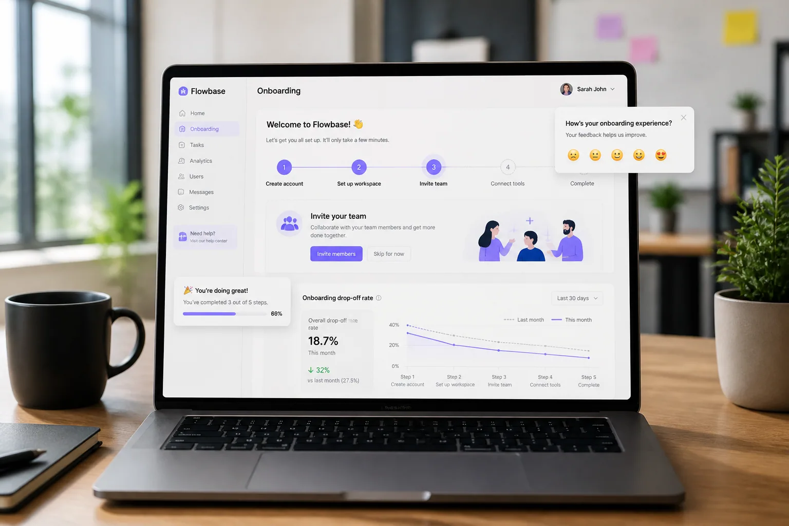
Onboarding is where SaaS growth either compounds or leaks away. It is the first real test of whether a visitor can become an activated user, and the research makes the stakes hard to ignore: 40-60% of SaaS churn happens in the first 90 days, and day-1 drop-off is often around 40-60% as well. If users do not reach value quickly, retention can fall to 7-30% by day 7 and 5-15% by day 30. Sources: Feedback Analytics https://feedback-analytics.com/en/blog/onboarding-feedback-saas and StartupJuicer https://startupjuicer.com/blog/saas-onboarding-activation-teardown
That is exactly why feedback widgets are so useful in onboarding. They give product teams a lightweight way to understand where users hesitate, what feels confusing, and which moments create friction, without forcing a long survey at the wrong time. Done well, they help you collect insight in context, so you can improve activation and retention while keeping the experience calm and respectful.
Why onboarding is the most important place to capture feedback
If there is one place where feedback matters most, it is the window between signup and first value. This is the stage where users are forming their first impressions, and those impressions are often decisive. Frontegg reports that 21% of SaaS users expect full product access within one minute of signing up, while 48% have abandoned a product because signup was too slow. The same survey also found that 15% of users say they will never return after a bad first login, 58% have refused to sign up because login felt sketchy, and 36% abandon at the email verification stage. Source: https://frontegg.com/guides/saas-user-signup-expectations
That is why onboarding feedback is so valuable. It helps you identify the exact points where users lose confidence, not just the final outcome. Instead of guessing whether a drop-off came from confusing copy, too many fields, a missing integration, or a weak first-run experience, you can ask at the moment the friction happens. That makes the feedback more accurate and easier to act on.
Well-timed onboarding surveys also tend to perform better. Feedback Analytics notes that 3-5 questions per feedback moment can drive much higher response rates, with average response rates around 45-60% for well-timed post-onboarding surveys. The lesson is simple: keep it short, relevant, and tied to what the user is already doing. Source: https://feedback-analytics.com/en/blog/onboarding-feedback-saas
The moments in onboarding where users are most likely to struggle
Not every onboarding step is equally risky. Some moments are naturally more fragile because they require commitment, decision-making, or effort. The highest-risk moments usually include first login, feature discovery, first task completion, and any step that asks users to configure something important before they have seen value.
First login is the emotional handoff between promise and reality. If the login feels slow, suspicious, or unnecessarily complex, users may never get to the product itself. Feature discovery is the next danger zone because users often do not yet know where to look or what to click. First task completion is where they either feel momentum or hit a wall. If the product demands setup before payoff, friction shows up fast.
A useful way to think about onboarding is as a sequence of confidence checks. At each step, the user is asking, even if silently, “Is this worth my time?” Feedback widgets help you answer that question with evidence instead of assumptions.
How to identify friction at first login, feature discovery, and first task completion
At first login, the goal is not to ask users a long list of questions. The goal is to detect whether the experience itself is creating anxiety. If users are slowing down at email verification, password creation, or workspace entry, a small widget can ask a simple question like, “Was anything unclear in this step?” That gives you a signal without making the experience feel heavy.
For feature discovery, the best feedback comes after a user has had time to explore but before they have fully disengaged. If they click around and still do not find the feature they need, a subtle prompt can ask, “Did you find what you were looking for?” or “What were you trying to do today?” This kind of prompt works because it aligns with the user’s actual goal.
At first task completion, feedback should focus on progress, not judgment. For example, after a user imports data, creates a project, or sends their first message, you can ask what almost stopped them. That framing reveals hidden blockers such as unclear labels, missing guidance, or too many setup choices. It also gives users a chance to explain friction while the experience is still fresh.
When to trigger feedback widgets without interrupting momentum
The key to respectful onboarding feedback is timing. If you interrupt too early, you make the product feel needy. If you wait too long, the memory of friction fades. Good timing usually comes from three signals: delay, milestones, and abandonment intent.
A delay-based trigger gives the user a few seconds or minutes to orient themselves before asking for input. This works well on first-run screens, especially when a user has landed in the product but has not yet taken an action. The prompt should appear only after the user has had a fair chance to engage.
Milestone-based triggers are often the best option. If a user completes signup, connects an account, finishes a tutorial step, or reaches an “aha” moment, that is an ideal time to ask for a quick reaction. They have already invested effort, so feedback is more likely to be thoughtful and less likely to feel intrusive.
Abandonment signals are especially useful because they catch friction before it becomes churn. If a user pauses for a long time, moves the cursor toward the close button, or abandons a setup step, a lightweight widget can ask what got in the way. The goal is not to trap them, but to understand why momentum stopped.
In practice, the best onboarding widgets are the ones that feel almost invisible. They should appear only when the user has enough context to answer and enough breathing room to do so comfortably.
Using delays, milestones, and abandonment signals to collect better feedback
Each trigger type tells you something different. Delays are good for catching confusion. Milestones are good for measuring satisfaction and confidence. Abandonment signals are good for identifying blockers. If you use all three thoughtfully, you can map the funnel with much more precision.
For example, a survey after account creation can reveal first impressions. A survey after the first key action can reveal whether users reached the “aha moment.” A later survey around day 30 can reveal whether expectations matched reality. Feedback Analytics recommends these three moments because each one surfaces a different layer of insight: first impressions, aha moment, and retrospective evaluation. Source: https://feedback-analytics.com/en/blog/onboarding-feedback-saas
The strongest approach is to keep each prompt tied to one stage of the journey. Do not try to diagnose the entire onboarding experience in one widget. Ask one small question at the right time, then let the data accumulate across the journey.
How to write feedback prompts that feel natural during onboarding
The best onboarding prompts sound like help, not interrogation. Users are much more likely to respond when the prompt feels relevant, concise, and respectful of their time. That means avoiding generic questions like “How are we doing?” and instead asking something specific to the step they just completed or abandoned.
A natural prompt usually does three things. It acknowledges the moment, asks one clear question, and keeps the response effortless. For example: “Quick question: was anything unclear while setting up your workspace?” or “What almost stopped you from finishing this step?” These prompts are short enough to read instantly and specific enough to generate useful answers.
Tone matters too. In onboarding, the best tone is usually calm, conversational, and lightly supportive. You are not trying to sound clever. You are trying to sound useful.
Choosing the right tone: micro-prompts, conversational nudges, or lightweight surveys
Micro-prompts are ideal when you want the lowest possible friction. They are short, often one question, and sometimes paired with a simple text field or one-click response. These work well after a high-risk step, such as verification or first task completion.
Conversational nudges are better when you want users to explain an experience in their own words. They feel more human and can surface details that multiple-choice answers miss. A prompt like “Tell us what you were expecting to happen” can expose misunderstanding in a way that rating scales never do.
Lightweight surveys are useful when you need a little more structure, but they should still stay focused. Three to five questions is usually enough. Anything longer risks turning onboarding into homework. If you need deeper research, the widget can act as the first layer, followed by a follow-up interview or email.
The right format depends on the moment. If the user is mid-flow, use the smallest possible prompt. If they have just completed an important milestone, you can ask a few more questions without causing friction.
How to segment onboarding feedback by behavior, device, and feature usage
Feedback is far more useful when it is segmented. A single complaint may not mean much on its own, but when you separate responses by behavior, device, and feature usage, patterns become obvious. For example, mobile users may struggle with a layout issue that desktop users never see. New users may misunderstand a feature that power users breeze through.
This is where contextual collection becomes especially valuable. Lite Feedback captures browser, operating system, device, exact page, and timezone automatically, which makes it much easier to understand where the issue happened. That context helps product teams prioritize real problems instead of reading every response as if it were the same kind of feedback. Learn more here: https://litefeedback.com/
Behavioral segmentation is just as important. Compare users who completed onboarding with users who dropped off. Compare users who activated a key feature with those who did not. Compare people who clicked help content with those who stayed silent. The differences often show you where friction is hiding.
Feature usage segmentation can also help you connect feedback to activation. If users who never discover one important feature repeatedly mention confusion, that is a strong signal that your onboarding needs better guidance, not just more marketing copy.
Prioritizing issues that block activation and drive early churn
Not every piece of feedback deserves the same level of attention. The best prioritization method is to ask two questions: does this issue block activation, and does it affect enough users to matter? If the answer to both is yes, it belongs near the top of the backlog.
Issues that slow first login, obscure the first key action, or create a dead end in setup usually deserve immediate attention. These are the kinds of problems that can cause early churn, which is especially costly because so much SaaS churn happens in the first 90 days. Source: https://feedback-analytics.com/en/blog/onboarding-feedback-saas
Another useful filter is emotional intensity. If users describe an experience as confusing, sketchy, slow, or frustrating, they are telling you about trust as much as usability. In onboarding, trust issues are often as damaging as feature gaps.
Once you have grouped feedback by theme, look for changes that unlock the most momentum with the least complexity. Sometimes the fix is a better tooltip. Sometimes it is fewer form fields. Sometimes it is clearer language or a smarter default. The point is to focus on the friction that sits directly in front of activation.
There is strong evidence that even small reductions in friction can matter. StartupJuicer reports that reducing form fields from four to three can increase signup conversions by up to 50%, and that forms with five or more fields often convert less than 8%. Source: https://startupjuicer.com/blog/saas-onboarding-activation-teardown
Examples of onboarding improvements driven by feedback data
Real-world cases show how small onboarding changes can create measurable growth. Yotpo improved onboarding with tooltips and reminders and saw 1-week retention rise by 50%, 2-week retention increase by 60%, and new review generation grow by more than 40%. Source: https://www.floatcare.com/case-studies/how-yotpo-drove-widespread-increases-in-engagement-42-new-feature-adoption-300-and-retention-rates-50
Factors.ai embedded a feedback widget and in-app surveys into onboarding and saw NPS rise by 40% while also improving product adoption. That is a good example of how feedback is not just a research tool. It can also become part of the activation system itself. Source: https://productfruits.com/case-studies/factorsai
A B2B analytics SaaS took a more structural approach, restructuring onboarding and defining activation more clearly. The result was trial-to-paid conversion moving from 7% to 19%, and day-30 retention for new paid users improving from 61% to 84%. Source: https://www.datai.it/en/case-studies/b2b-analytics-trial-to-paid
These examples share a common thread: the teams did not guess their way to better onboarding. They listened, identified friction, and removed the smallest changes that produced the largest lift.
The most common mistake is asking too much too soon. If the user has just signed up, logged in, or finished a critical step, a long survey can feel like a tax on progress. Keep the first prompt short and only expand if the user chooses to engage.
Another mistake is asking irrelevant questions. If the prompt does not match the user’s current task, it will feel disconnected and intrusive. Ask about the step they just experienced, not the entire product.
A third mistake is ignoring mobile. On smaller screens, even a modest widget can become annoying if it blocks content or requires too much typing. Mobile feedback should be especially concise, with clear dismissal options and minimal friction.
Teams also make the mistake of collecting feedback without acting on it. If users repeatedly report the same issue and nothing changes, they learn that the widget is cosmetic. That hurts trust. Feedback only works when it leads to visible improvements.
A simple framework for testing and optimizing feedback widgets in your funnel
A practical optimization loop can be kept very simple. First, choose one onboarding moment to measure, such as first login or first key action. Second, define one question that maps to that moment. Third, set the trigger based on timing, milestone, or abandonment signal. Fourth, segment responses by device and behavior. Fifth, prioritize fixes that remove the biggest barriers to activation.
Then test one change at a time. For example, try a different prompt tone, a shorter question, a later trigger, or a more specific milestone. Measure response rate, completion rate, and downstream activation outcomes. If the widget is helping you learn more without hurting progress, it is doing its job.
The best onboarding feedback systems are not noisy. They are precise. They appear at the right moment, ask the right question, and feed a workflow that turns confusion into product improvements. If you want a simple way to start, a tool like Lite Feedback can help you launch a web feedback widget quickly and capture contextual responses without heavy setup. More details are available at https://litefeedback.com/
When you combine respectful timing, short prompts, and contextual analysis, feedback widgets become more than a support channel. They become an activation tool. And in SaaS, that can be the difference between users who drift away after day one and users who stay long enough to become retained customers.